How to turn a logo into an animated background that never covers the text
Read the drawing rules out of the mark, grow the shape from a seed, and measure where the words sit before you draw a single line. With the contrast numbers we got.
Also in: Español
A generative background looks great right up to the frame where a branch crosses behind the one word the viewer had to read.
We hit that while making the studio's presentation video. The brief was to replace a plain grid with lines that build up like a digital tree, in the spirit of the Mounaji logo. The trap with that kind of request is that the background becomes the protagonist, and the sentence on top of it turns into decoration.
What follows is the recipe we ended up with. It has three parts, and the order matters.
1. Read the rules out of the mark, not the look
Our logo is a single polyline: straight segments at free angles, tight zigzag turns, two parallel vertical stems at the bottom and round line caps. There are no nodes or dots anywhere.
Those become the drawing rules for the background:
- every branch is a straight segment, and the next one turns sharply away from the previous direction;
- the default version starts from pairs of vertical trunks at the bottom edge, like the stems of the mark;
- tips light up when a branch finishes growing, which is as close as you can get to a round cap without inventing an ornament the logo does not have.
Copying the outline of a logo into a background gives you a watermark. Copying its rules gives you something that is recognisably the same brand and can fill any frame.
2. Grow it from a seed, the same way everywhere
The geometry is one pure function, crecerArbol, that takes the frame size, a
seed, a density and the list of areas it may not enter, and returns every
segment with the second at which it starts and stops drawing. No randomness
from the environment: the same seed gives the same tree, and a test checks it.
That function runs twice. In Node, the tests call it directly. In the browser, the render inlines the very same function body into the page, so the tree you test is the tree that gets drawn. There is no second implementation to drift.
3. Measure the text first, then forbid it
Before the first branch grows, the page measures the boxes of everything that has to stay readable: every line of the sentence with all its words already laid out (even the ones still hidden, waiting to animate in), the footer and the tag chips. Each box gets a small margin and goes into the list of reserved areas.
The growth rule is then simple: a segment is only accepted if eight points along it are all outside every reserved box and inside the frame, and if it does not cross a segment already drawn. When no candidate direction passes, the branch ends in a tip. The central trunks also stop just below the lowest box above them, so they frame the sentence instead of running into it.
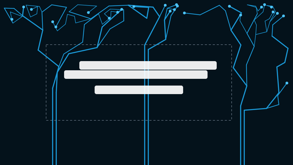
Here is the tree for a three-line sentence, with seed 20260929, generated by that function. The dashed box is the reservation; the white bars stand in for the words.

And the same seed with the reservation removed. Eleven of its 120 segments go through the text area, and the middle trunk climbs straight into it.
What we measured
Readability here is a number, not an impression. For every frame from 0 to 6 seconds, in the five text scenes of the video, we took the 99th percentile of the background luminance under the text box and computed the contrast of the text colours against it.
- White text: between 17.9:1 and 20.6:1.
- Cyan text (
#1eb0f8): between 7.35:1 and 8.44:1. - The grid background it replaced gave the same cyan 5.8:1.
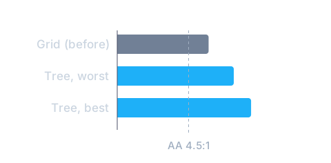
The grid already passed the WCAG AA line for body text (4.5:1). The tree passes it by a much wider margin in its worst frame, because the busiest part of the drawing is, by construction, never behind a letter.
Tests that fail when they should
The geometry has twelve tests: same seed gives the same tree, no branch enters the text box or leaves the frame, growth goes from root to tip, no branches cross, trunks come in pairs like the logo, more density means more branches.
A test only counts if it goes red when the thing it guards breaks. So we broke it on purpose. Removing the reservation turns three of the twelve red; removing the no-crossing rule turns another three red. With both in place, all twelve pass.
We also tried a second, fainter canopy behind the first to add depth. It crossed the front one and tied knots right above the text. With one canopy it reads as the logo; with two it reads as a net. It was taken out.
The short version
- Turn the mark into rules: segment shape, angles, how it starts, how it ends.
- Make the shape a pure function of a seed and run that same function wherever it is drawn.
- Measure the laid-out text first and pass it in as forbidden space.
- Measure the contrast frame by frame, and keep the test that would catch a regression.
Have a case where you want to see this working? Tell us what your business does and we will build it on your own material.